top of page


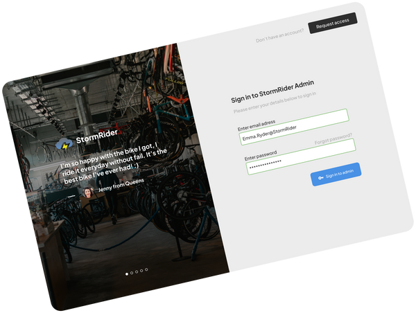
StormRider Dashboard
SaaS business management software
Market research
Competitive analysis
Persona
Flow diagram
Wireframe
Low-fidelity UI
Design System
High-fidelity UI
Where:
Long Island, New York
What:
Desktop/Web Application
Why:
Portfolio Project
Role:
Designer, Researcher
Category:
SaaS Product
When:
July 2023
Market Research
The Good:
The SaaS industry has grown rapidly over the past decade. The industry is worth an estimated $195 Billion. The industry as a whole has grown about 500% over the past seven years.
The Bad:
The SaaS industry has a high customer churn over rate. This issue is because of poor customer service, expensive pricing, lack of new innovations, and being a oversaturated industry.

The average annul churn rate rate for SaaS companies is 5-7%. A "good" churn rate is around 3%
Competitive analysis
I analyzed 2 other popular SaaS applications comparing their reviews and general reception to gain a general understanding of the SaaS landscape.


G2 Track
Overview:
G2 Track is a SaaS management tool the keeps track of different software licenses and agreements. Tracks SaaS apps to better understand and report how a companies uses all the different apps.
Pros:
Helpful for tracking all the different apps a company uses and removing SaaS that aren't being utilize or finding shadow IT. Visualization of data
Cons:
Limited customization, slow release cycles, benchmarking data hidden behind the premium version
Zluri
Overview:
Zluri is a tool for managing SaaS applications. It is able to automate tasks like adding or removing users from different apps, centralize SaaS licenses information, and monitor spending on SaaS apps.
Pros:
Very helpful for onboarding and offboarding users to different SaaS. Centralize SaaS license information in one place. Monitor spending on other SaaS apps.
Cons:
Problems integrating certain apps, Sometimes information isn't completely accurate. Integrating Zluri into a company can take a lot of effort/time.


Personas
I created two personas based on different types of users who would use this program; a Store Manager and a Regional Manager.


Flow Diagram
To outline all the necessary functionality I created a simple flow diagram of the main tasks users would within the app.
Main task flow

Low-Fidelity wireframe
After establishing the user flow, I created the low-fidelity wireframe of the main user tasks

Design System
Once the main user flow was completed, I started planning out color palette and fonts for the app
Color Palette:
Primary
Secondary
Accent
2E2E2E
FFFFFF
4991E5
Primary - Main color for text
Secondary - Main background color
Accent - Highlight key elements
Additional Colors
ECECEC
Secondary background color
7A7A7A
Secondary text color
FAD6DD
A53313
D7FAD6
48A531
FAF7AE
CFC70D
Additional colors used for icons and other elements
Fonts:
Plus Jakarta Sans
Medium, Extra Bold
AaBbCcDdEeFf123456789
Sizes:
12, 14, 20
AaBbCcDdEeFf123456789
High-fidelity UI
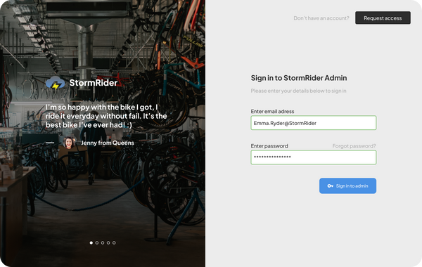
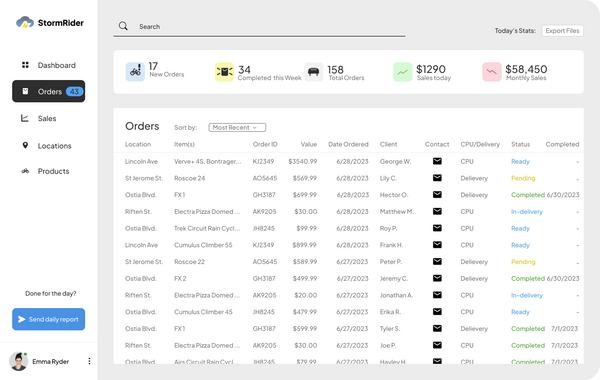
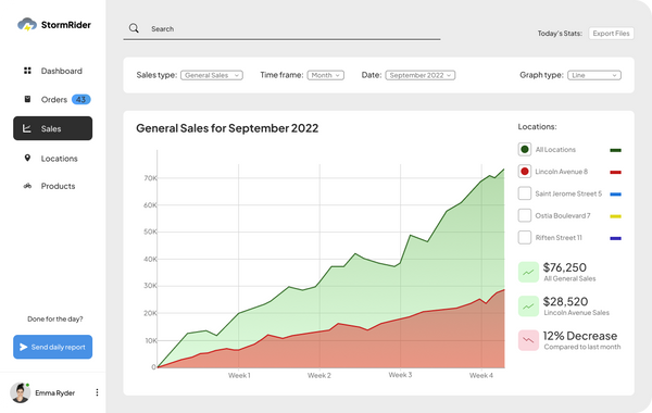
The low fidelity screens were used as a base to refine and turned into high fidelity screens. The design system was followed to keep all aspects of the design consistent and matching with each other.



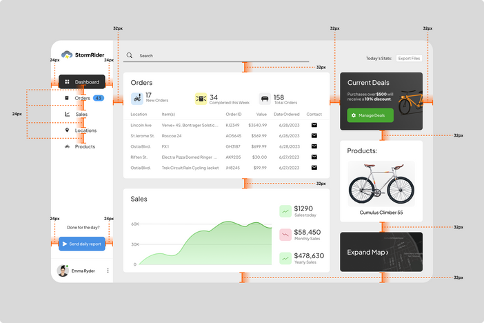
Alignment and grid
I picked an 8-point grid for this project spacing elements apart on multiples of 8. This was to give it a consistent look and even look that gave each element enough space for itself.


bottom of page